
ODD JOBS
OVERVIEW
Odd Jobs is a e-commerce responsive website designed to provide individuals with a reliable and secure way of hiring suitable contractors for their residential projects. This was a research heavy project that was handed off to developers with a comprehensive design system, which allowed users to purchase a service and rate their contractors.
SPRINT: 3 Week
TEAM: 2 UX Designers & 4 Developers
ROLE: UX/UI Designer
TOOLS: Sketch, Keynote, Invision App, MagicMirror, Flowmapp, Overflow, Trello, Photoshop, Slack, Google Forms & Slides
Methodologies: Kanban | Luke Wroblewski’s Best Practices| Lean UX | Hyper Island Ideation| IBM Design Thinking
PROBLEM
Odd Jobs is intended to achieve a user-friendly website to assist customers with choosing the best contractor for their at home projects.
We observed that customers are finding it difficult to hire a reliable contractor for their project, good quality and customer support, which cause the company to issue significant refunds and receive poor reviews.
We plan to achieve improved customer satisfaction by implementing thorough background checks, verify professional references and provide photo upload feature for customers and professionals. We will measure our success by tracking revenue, monitoring user reviews and customer referrals.
FRAMEWORK
These phases guide us through a process that provides best practices for developing a digital product for an efficient user experience.
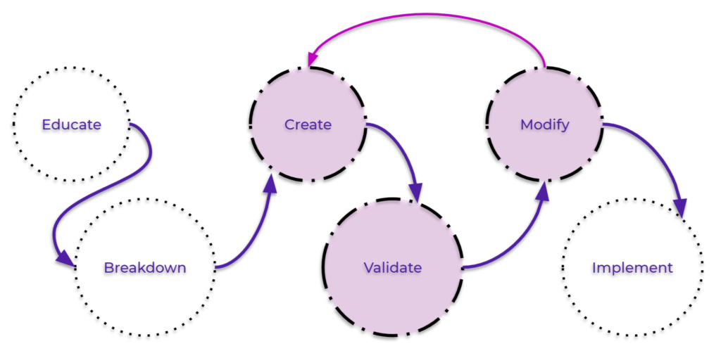
EDUCATE
In this phase we educated ourselves with information from our competitors, the users and data analysis to decide our heuristics and UX strategy.
COMPETITIVE AUDIT
We research and observe how our competitors are currently servicing their users and take key features to implement in our website.
These are a few of the 15 companies we reviewed which showcased some best practices.

TAKEAWAYS
-
Provide clear CTA’s on the homepage and primary nav to guide users
-
Give users the ability to choose directly from the most popular projects
-
Reassure users of company standards and expectations
-
Display only one task at a time before allowing users to move on by disabling more options
-
Give users an alternate source of finding their most suitable contractor by providing a list view and map view
-
Show impartial reviews directly from satisfied customers
-
Provide example text in input fields and show error messages when information is entered incorrectly
-
Allow users to chat with contractors and upload photos of their project needs
-
Show a progress bar to guide the user and give them a status of where they are in the hiring process
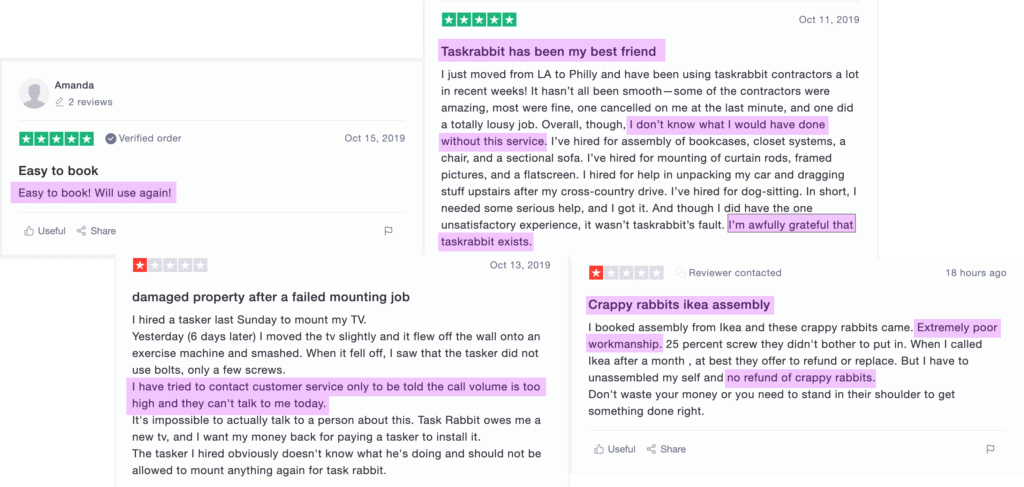
SOCIAL LISTENING
Reviews from current users of our competitors who voiced that they wanted reliable contractors, great customer support, and quality work.
SURVEY DATA
The survey consisted of 38 respondents ranging from age 20 – 65.
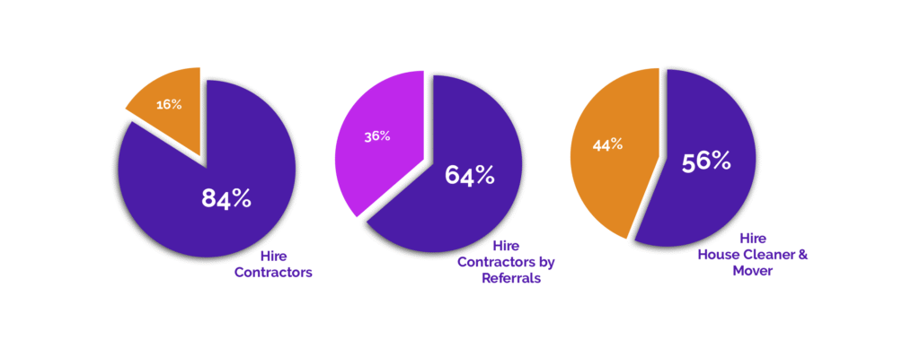
HIRE CONTRACTORS
Majority of surveyors stated they currently hire contractors or would hire a contractor in the future.
This information validated the need for Odd Jobs!
HIRE CONTRACTORS BY REFERRALS
Most surveyors preferred to hire a contractor through a referral from a friend.
These results are why we chose reviews as one of our KPI’s and considered it our MVP!
HIRE HOUSE CLEANER & MOVER
Of surveyors, overwhelmingly, mentioned that they would usually hire a house cleaner and a mover.
This guided us in creating the most suitable personas.
BREAKDOWN
During this phase we determined our product users and the journey they would embark by identifying the goals, objectives, and strategy for the UX/UI.
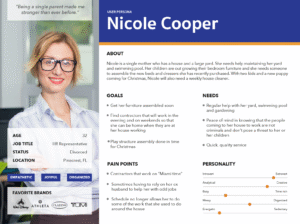
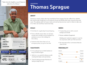
PERSONAS
Our personas were created based on our data from the survey responses.
Nicole best fit the age criteria of surveyors and Thomas is the seniors demographic group that would benefit from Odd Jobs.
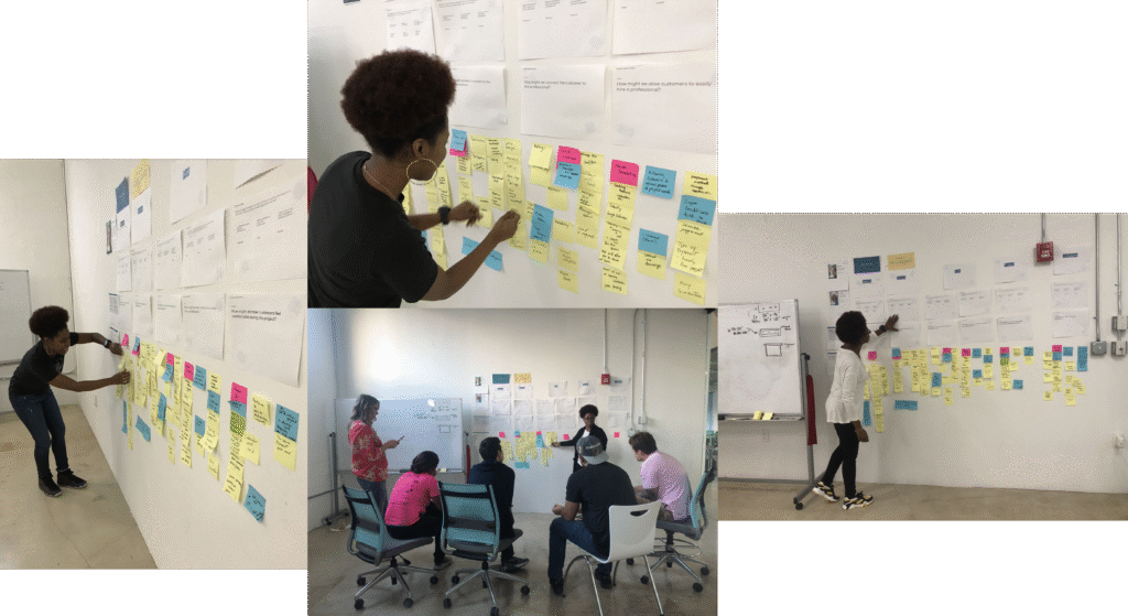
USER JOURNEY
The User Journey is a very important process in the development of a website. We collaborated with the web development team to generate ideas and features for Odd Jobs by allowing each person to write down on post-its which features they assume were necessary for the user workflow. We also considered how the user would feel using these features.
MVP SESSIONS
Once we generated enough features we began the MVP Session where we voted on the best features with stickers previously given to the Product Manager, Designers and Developers. We then discussed the importance and value of each feature and the effort it would require to implement it.
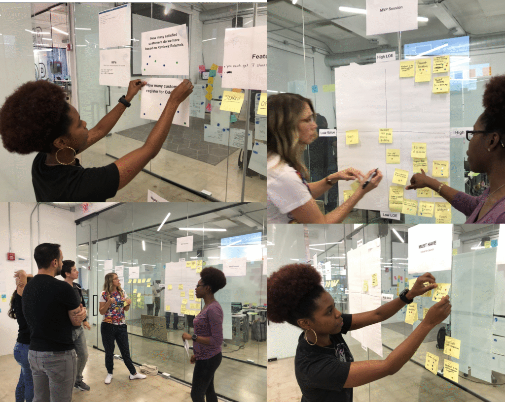
KEY PERFORMANCE INDICATORS (KPIs)
Revenue, Referrals and Reviews were notably our Key Performance Indicators, and how we measured our success for Odd Jobs.
MINIMAL VIABLE PRODUCT (MVP)
Having a refer a friend page was the most important feature to have on the Odd Jobs website, because it would generate revenue and create continuous positive reviews.
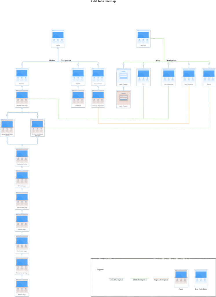
SITEMAP
Provides a visual overview of the website, displaying where each page is located.
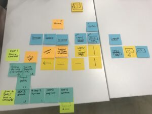
LO-FIDELITY
First version of the sitemap, sketched on post it paper to ideate and easily move each page in to the right order.
HI-FIDELITY
This finalized version allows for accurate development when entering the creation phase and guidance for the overall development team.
UX STRATEGY
Odd Jobs is committed to providing 24/7 support for both customers and contractors. We take pride in sharing authentic testimonials from satisfied clients, partnering with verified professional contractors, and ensuring every transaction is processed securely and reliably.

These keywords were strategically for our UX strategy to structure Odd Jobs with a clear purpose—ensuring users immediately understand our services and feel confident engaging with our platform.
CREATE
The Create phase involves translating initial concepts into tangible design solutions for the website. During this stage, ideas are iteratively developed, entering feedback loops that help validate assumptions, refine design directions, and align the product with user needs and business goals.
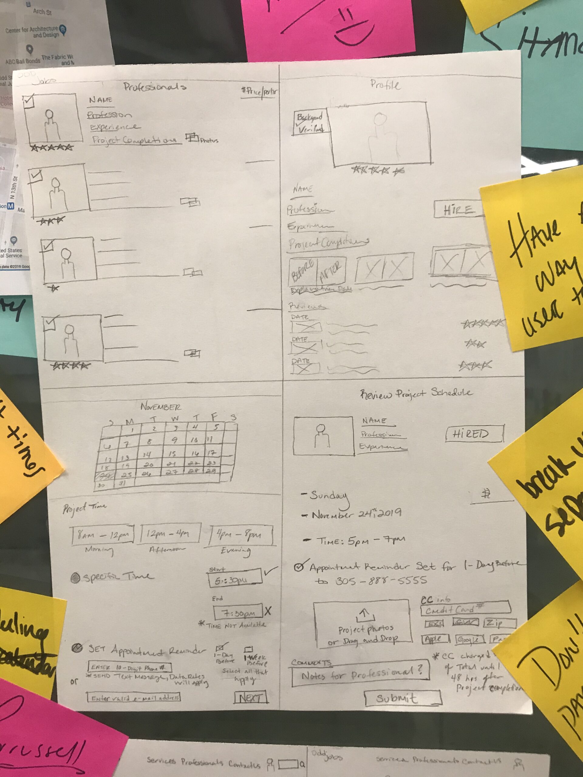
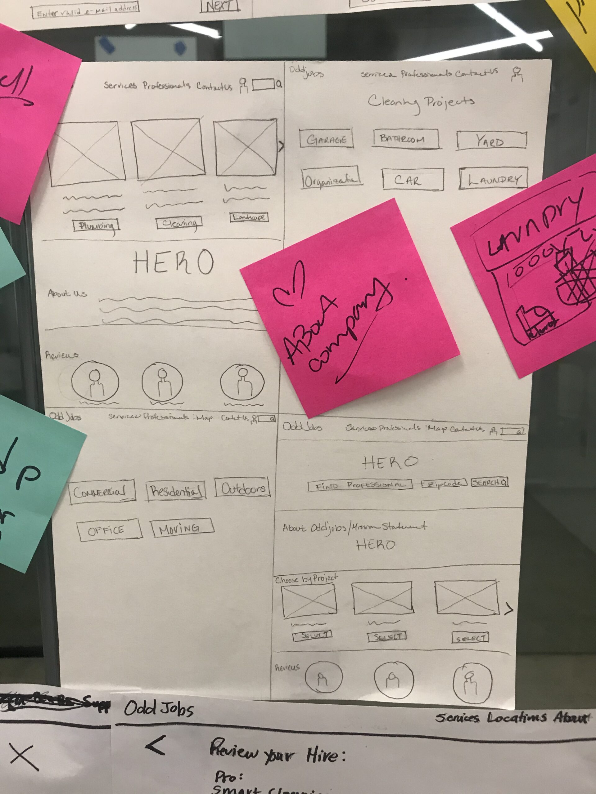
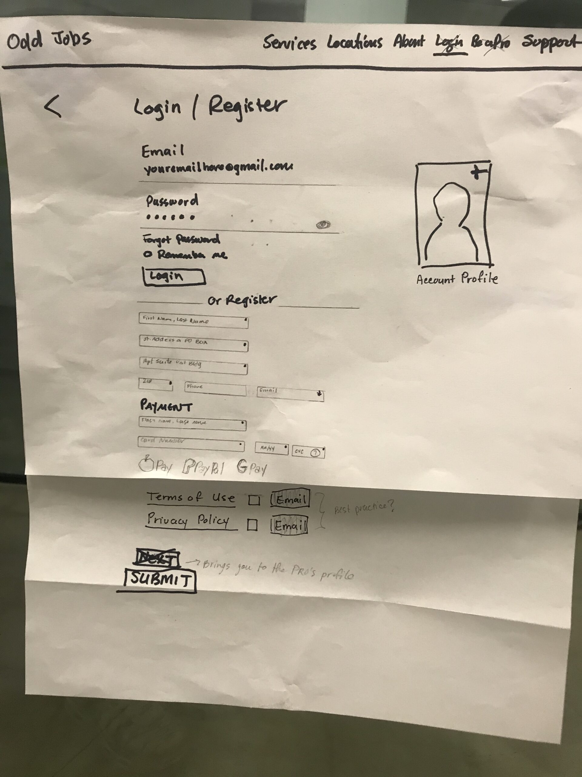
PAPER SKETCHES
Lo-fidelity concept designs of website ideas and features.

WIREFRAMES
Lo-fidelity gray-scale digital designs of the product structure and workflows.
My partner and I each created wireframes to explore different ideas, then refined them into one unified design through peer testing. The feedback was clear and consistent which helped us decide the strongest elements to merge from both designs.
The final wireframe featured:
-
A large hero image in the first module, paired with a Google-style search bar positioned on the left (without a carousel).
-
Prominent CTA tiles highlighting popular services in the second module.
-
Four customer testimonials in the third module, with company recognitions intentionally omitted from the homepage to focus on user trust and real experiences.
This approach improved the usability of our design and also ensured that every decision was grounded in feedback and user value.

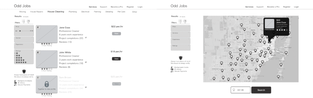
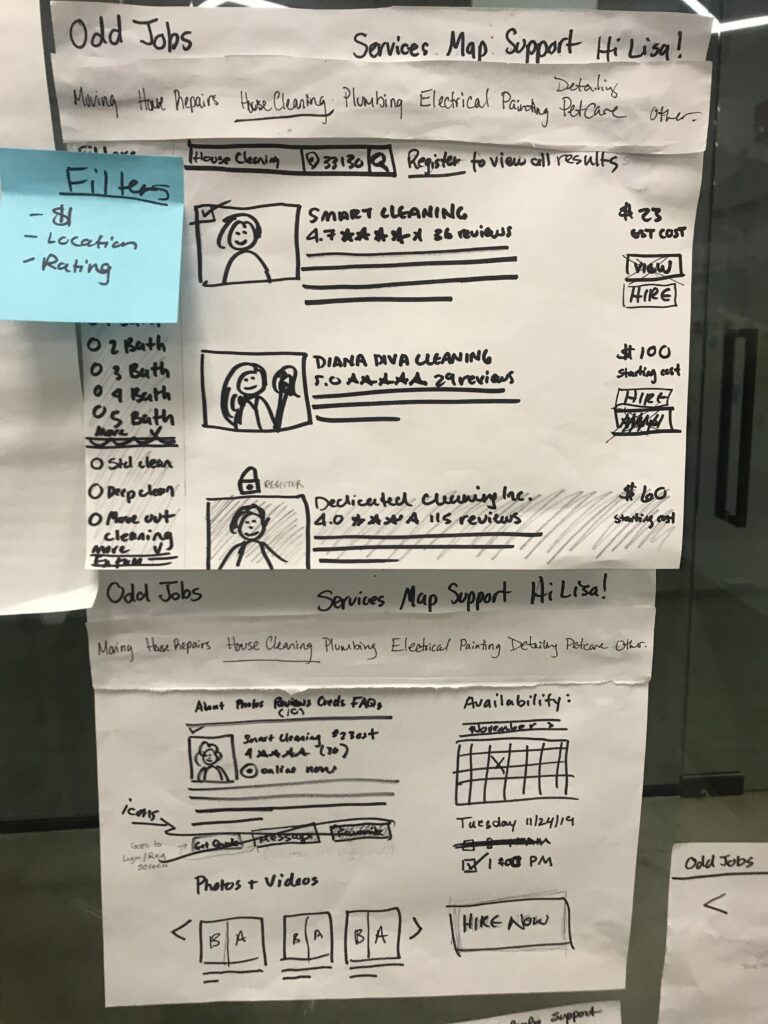
List & Map View
On the contractor results page, users are given the option to toggle between a list view and a map view, allowing them to choose their preferred method of browsing available contractors. This feature empowers users with greater control and flexibility in how they explore service providers.
During usability testing, 4 out of 6 participants responded positively to the map view, describing it as a visually engaging way to display contractor locations. The interactive hover states on the map enhanced user engagement by providing immediate, location-specific contractor details in a dynamic and intuitive format.